


Case Study
Rope & Cord Website Redesign
Redesigning an eCommerce navigation for clarity, confidence, and conversion.
Project Overview
Role: Lead Designer
Timeline: July 2022 - September 2022
Tools: Figma, Microsoft Clarity, Google Analytics, Canva
Focus: Navigation redesign, UX wireframes, full desktop and mobile UI, usability insights
Project Scope: Simplify the website’s navigation structure and homepage flow to make it easier for users to start shopping quickly, shop by use-case, and find the right material without needing to know the exact name.

The Problem
Rope & Cord had a deep product catalog — dozens of categories, materials, thicknesses, and types of rope and cord — but no clear entry point for new or casual users.
Users often got stuck at the very beginning of their journey:
Unsure where to start unless they already knew product specs
Navigation dropdowns were overwhelming and redundant
No paths for people browsing by application (e.g. “camping” or “decor”)
“Fishing” as a use case had poor visibility despite being one of the top-selling segments

Project Outcomes
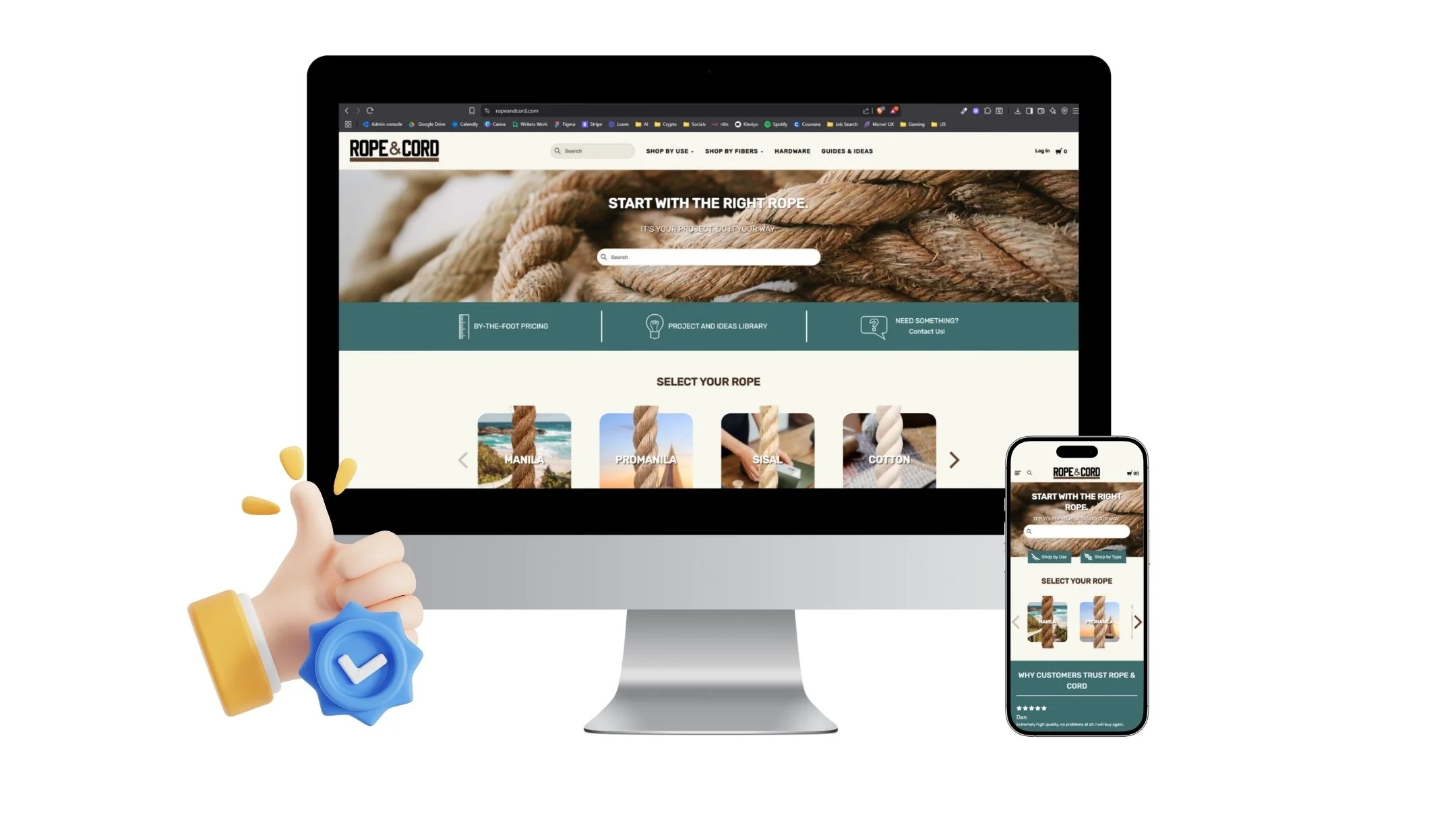
✓ Added “Shop by Use” and “Shop by Fiber” as primary entry points
✓ Created a dedicated flow for use-specific products
✓ Improved homepage-to-product-page conversion by 22%
✓ Bounce rate dropped by 17% within the first month of launch
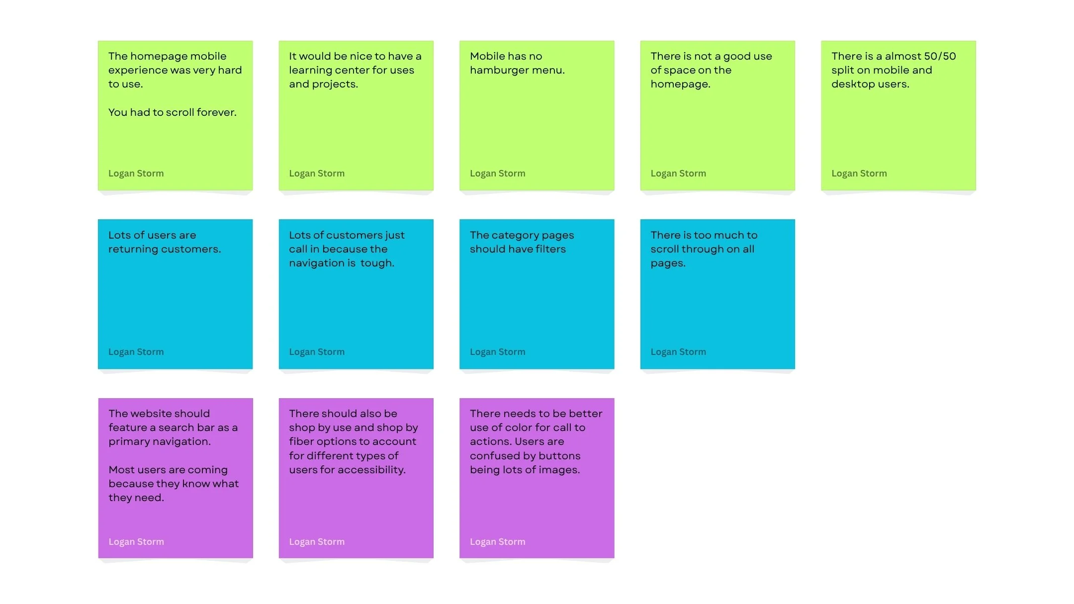
Research & Insights
Methods Used:
Click behavior tracking via Microsoft Clarity
Internal stakeholder interviews (customer support + product team)
Analytics deep-dive via Google Analytics
Competitor UX audits (e.g. REI, West Marine, Home Depot)
Insights:
New users often arrived through search but left quickly after landing on the homepage
Many users didn’t know the names of materials, but knew their project type
“Paralysis by options” was a common pattern — users scrolled, hovered, but didn’t click
Key UX Goals
✓ Reduce navigation complexity — remove duplication and streamline top-level categories
✓ Introduce “Shop by Use” paths — let users browse by intent (e.g., Fishing, Camping, Home Projects)
✓ Add “Shop by Fibers” navigation for users with technical knowledge
✓ Highlight key use cases like landscaping, marine, equine, etc. earlier in the experience

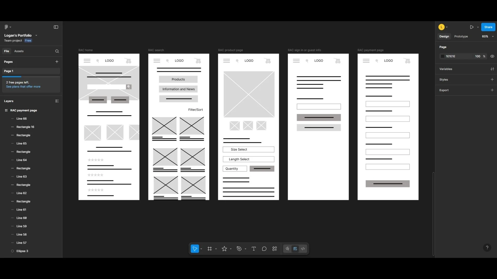
Wireframes & Ideation
Built wireframes for revised navigation system across desktop and mobile
Created dropdown menu with icon-based entry points for Use and Material (fiber)
Built new homepage modules: “Uses Cases,” “Fiber Types,” “Featured”
Mapped flows for multiple user journeys:
“I’m shopping for a project”
“I need a specific rope type”
“I’m browsing for ideas”
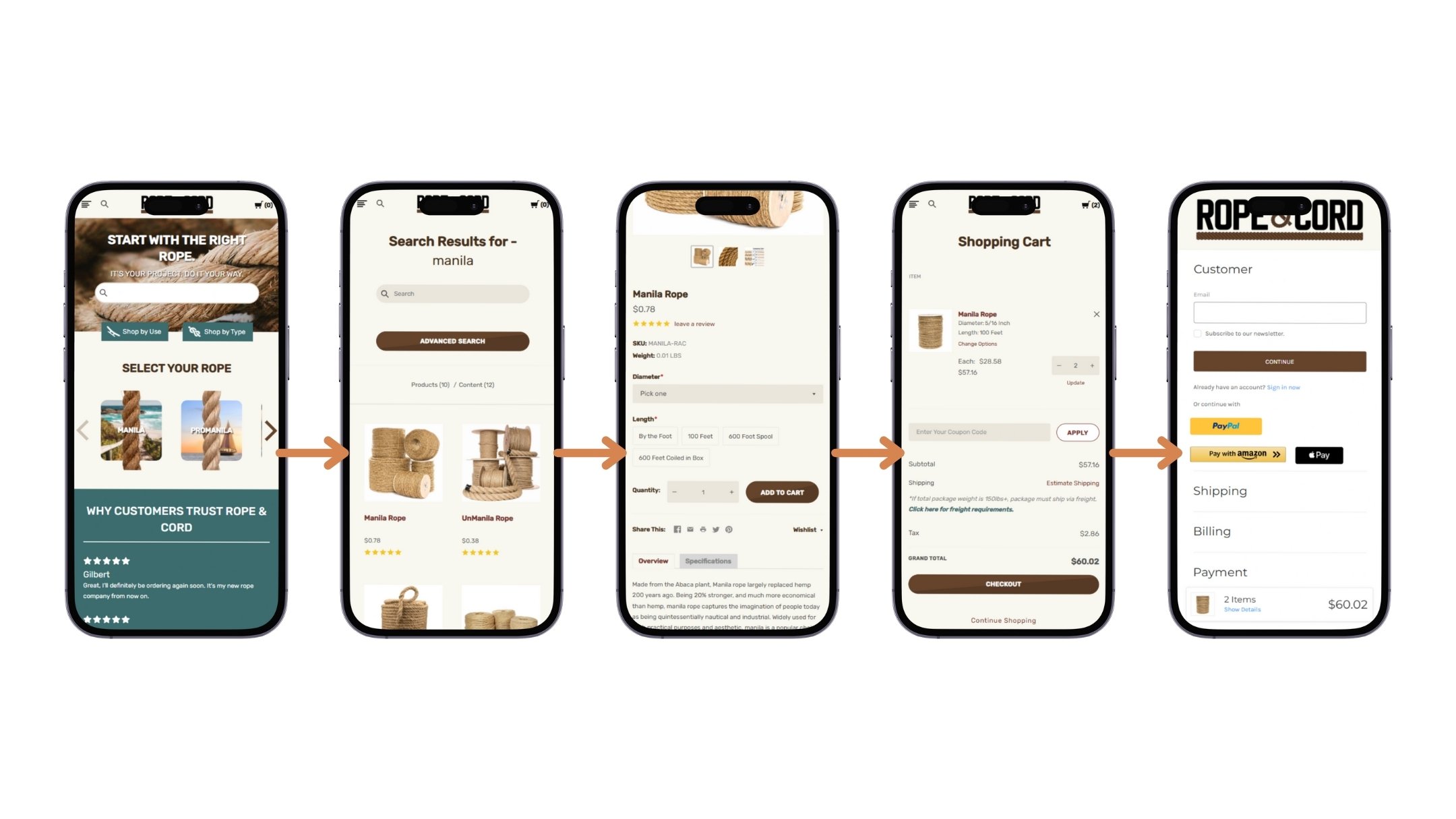
Visuals & Prototyping
Final UI emphasized:
Emphasis on the search feature for users who know what they want
Clean layout with bold entry points into “Use” and “Material” paths
Modular homepage cards for specific use-cases
Mobile-first dropdown menus with intuitive icons and collapsible filters
Visual consistency across all categories to reduce cognitive load
Usability Testing
Pre-Launch Testing:
4 moderated sessions via Zoom with new users
Tasks included:
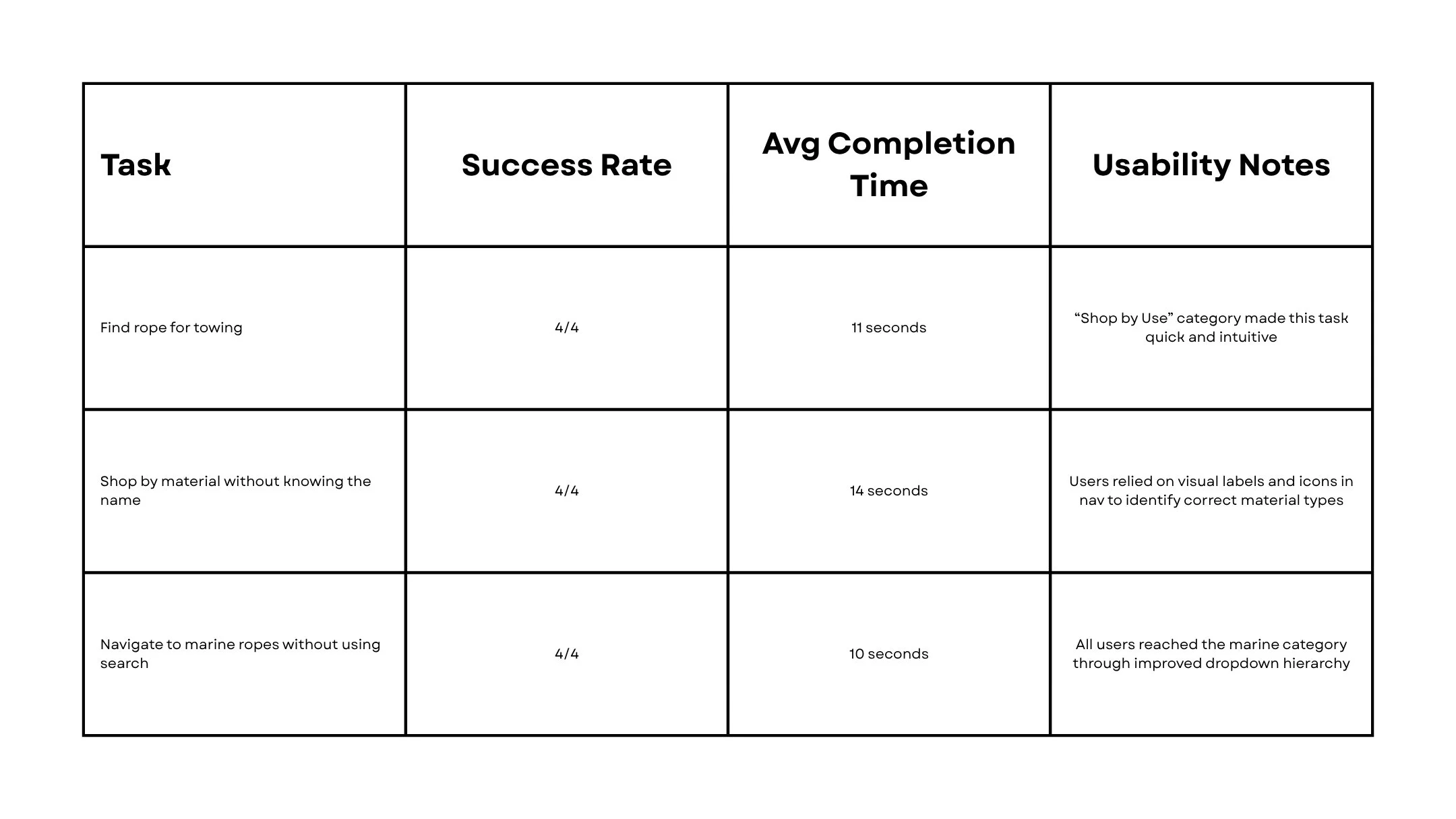
“Find rope for a towing”
“Shop by material without knowing the name”
“Navigate to marine ropes without using search”
Key Results:
4/4 completed all tasks faster than baseline
Avg. time to product page reduced by 38%
Most common feedback:
“I didn’t realize it could be this easy. The ‘shop by use’ just makes sense.”
“I finally know where to go without Googling rope types.”
Post-Launch Observations:
Marine and Landscaping category saw a 29% increase in traffic
“Shop by Use” funnel showed stronger engagement on mobile
Clarity heatmaps confirmed deeper interaction with dropdown menus
Key Takeaways
What I Learned:
✓ Navigation isn't just about structure — it’s about user psychology and intent
✓ Giving users multiple ways to browse (by use or material) increases confidence
✓ Too many options leads to no action — clarity drives conversion
What I’d Do Differently:
Push for even earlier wireframe testing with real users
Add on-page filtering and search refinements for even faster product discovery
Explore personalized entry points (e.g., “Recommended for You”)