


Case Study
Golberg Website Launch
Designing a seamless, mobile-first eCommerce experience for men’s activewear and jockstraps.
Project Overview
Role: Lead Designer
Timeline: October 2023 - December 2023
Tools: Figma, Microsoft Clarity, Google Analytics, Canva
Deliverables: Full ecommerce website, UX wireframes, high-fidelity designs, launch support

The Problem
Golberg was launching as a new DTC brand in the men’s performance underwear space — a category with high competition and high bounce rates.
They needed a fast, frictionless online experience that:
Gave shoppers confidence to purchase (especially on mobile)
Made navigation intuitive without overwhelming them
Showcased the brand’s edge — without complicating the journey
Key pain points in similar competitor sites:
Too many product options too soon
Overloaded nav menus and filter systems
Poor mobile tap targets or long checkout flows
Project Outcomes
✓ Launched Golberg’s full eCommerce site on-time in Q4
✓ Built a responsive, mobile-first experience with optimized conversion flow
✓ Achieved a 19% higher mobile conversion rate than baseline average for similar brands
✓ Reduced cart abandonment rate by simplifying checkout
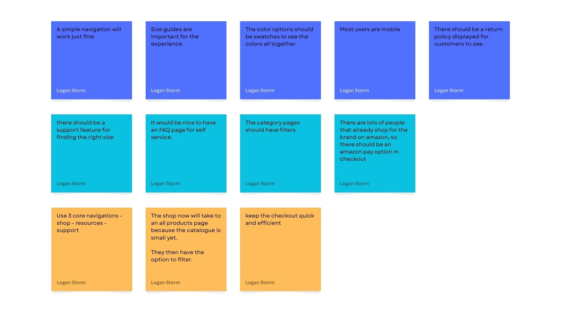
Research & Insights
Methods Used:
Stakeholder interviews
Competitive UX audit (6 brands)
Behavioral tracking post-launch (Microsoft Clarity & GA)
Informal click-path usability tests (5 participants)
Key Insights:
Users want to find the right product fast, without toggling between categories
Mobile was primary platform for 70%+ of site visitors
Clean visuals and consistent hierarchy were more trusted than flashy design
Users wanted to check out without an account — frictionless purchase mattered more than upsells
Key UX Goals
✓ Based on research, I defined the following UX objectives:
✓ Simplify product discovery with 3 core parent categories
✓ Design mobile-first with large tap targets and minimal scrolling
✓ Streamline checkout into as few steps as possible
✓ Build brand trust visually through bold, clean layout
✓ Incorporate analytics tools for real-time behavior insight post-launch

Wireframes & Ideation
I created low-fidelity wireframes for:
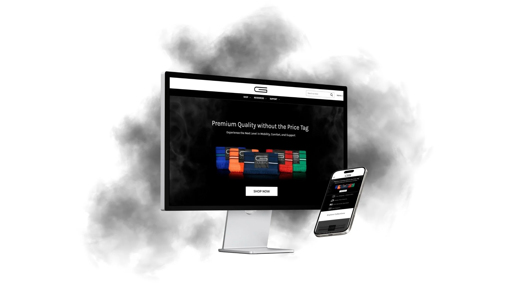
Homepage
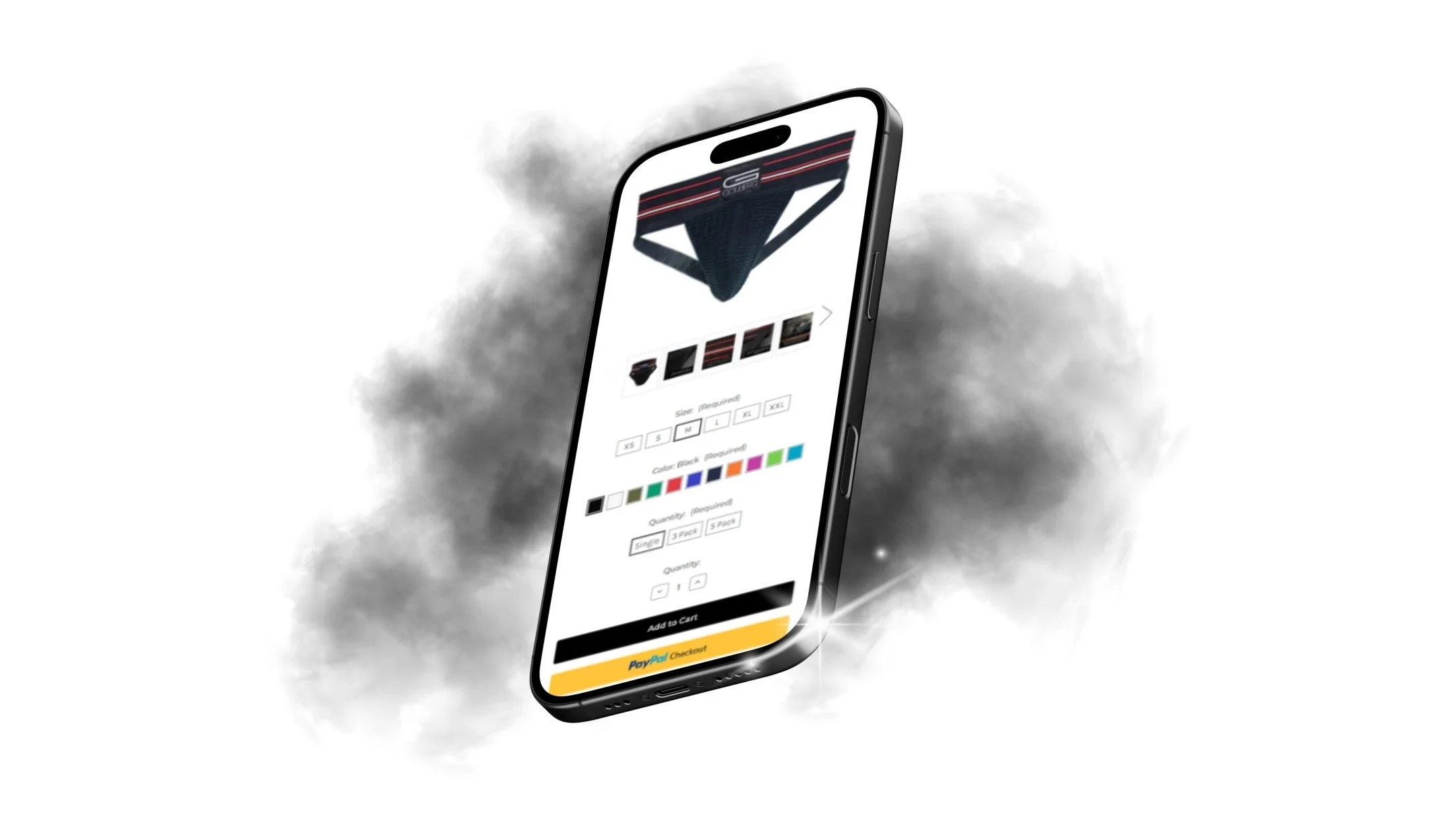
Product listing page (PLP)
Product detail page (PDP)
Cart + checkout flow
Early ideation included:
Fixed navigation bar with simplified nav
Scrollable product carousel with large images
Clear size selectors and variant options

Visuals & Prototyping
Final visual design emphasized clean lines, bold typography, and a black-and-white palette with occasional accent color pops.
Key UI decisions:
Full-bleed product images with zoom-on-hover
CTA buttons made large, consistent, and mobile-friendly
Footer with essential links and repeat CTAs for checkout

Usability Testing
Method:
5 moderated usability sessions using the interactive Figma prototype
Tasks:
“Find a XL black jockstrap of a 3 pack”
“Add it to your cart and check out as a guest”
“Find sizing info without leaving the product page”
Results:
4/5 completed all tasks successfully
Avg. task time was 32% faster than the competitor benchmark
Feedback included:
“It feels intuitive — I didn’t have to think about it.”
“This feels more modern than other stores I’ve used.”
Post-Launch Testing:
Microsoft Clarity revealed:
High heat activity around lifestyle photos and size selectors
Some users missed the category page CTA — led to CTA redesign

Key Takeaways
What I Learned:
✓ Simplicity scales better than cleverness — the cleaner the site, the faster the conversions
✓ Real-time behavioral data (Clarity, GA) unlocks continuous refinement post-launch
✓ Starting with mobile-first constraints made the desktop version feel even stronger
What I’d Do Differently:
Run usability testing earlier in the wireframe stage, not just hi-fi
Push harder for inclusion of product reviews or user-generated content (missed MVP opportunity)
Explore alternative navigation models (e.g., product quiz or filter overlay)