


Case Study
Paracord Planet
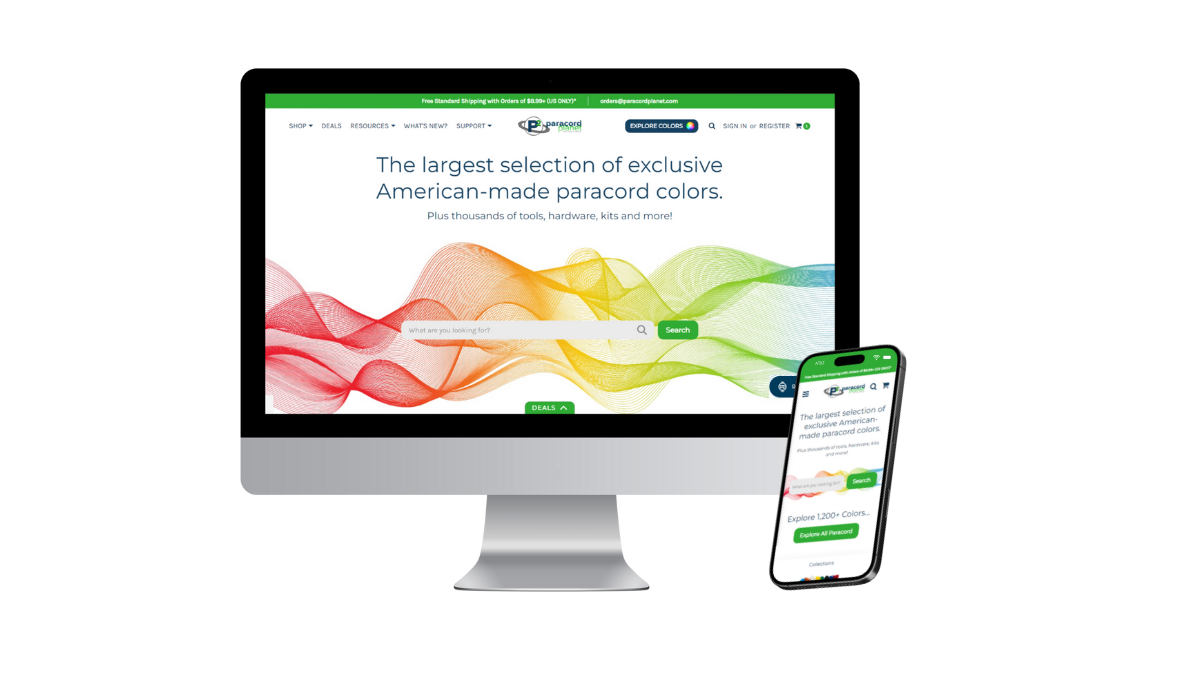
Full Ecommerce Redesign
Paracord Planet is one of the leading E-commerce brands for DIY paracord supplies and outdoor gear. The website had grown bloated with dozens of competing buttons, categories, and modals—making it difficult for users to find what they needed.
I led the UX redesign to streamline the experience, center search behavior, and increase conversions through a more focused interface, a new loyalty rewards program, and an optimized checkout/cart experience.

Project Overview
Role: Lead Designer
Timeline: January 2024 - March 2024
Tools: Figma, Microsoft Clarity, Google Analytics, Canva
Focus: UX/UI Redesign, Search Optimization, Conversion Flow, Loyalty Integration
The Problem
The site had overwhelming navigation, with cluttered dropdowns and too many decision points.
Users struggled to find products quickly, even though they knew what they were looking for.
The cart and rewards experience was outdated, requiring multiple screens and lacking incentive to return.
Business KPIs showed:
X High bounce rate on category pages
X Low returning customer rate
X Drop-off during cart process

Project Outcomes
Within 90 days post-launch:
✓ 21% increase in conversion rate
✓ 34% increase in new + repeat users
✓ 13% increase in newsletter signups
✓ 47% increase in Customer Lifetime Value from rewards program
✓ 33% increase in returning customers
Research & Insights
We used a combination of:
Microsoft Clarity heatmaps to identify dead zones and friction areas
Google Analytics to track funnel drop-offs
Customer feedback from support tickets + user reviews
Competitor analysis (REI, Home Depot, and Etsy for product discovery UX)
Key takeaways:
Users wanted faster search, not more menus
Many visited just to reorder or find a specific item
Rewards programs were an incentive—but hidden and underused

Key UX Goals
✓ Reduce visual and navigational clutter
✓ Make search the central interaction model
✓ Introduce a clear, simple customer rewards experience
✓ Streamline the shopping cart + checkout flow

Wireframes & Ideation
I started with low-fidelity sketches to reimagine the homepage and product flow:
Removed excessive menu tabs and consolidated categories into core paths
Elevated search to a central, dominant UX element across desktop and mobile
Created wireframes for a new shopping cart with real-time totals, reward point feedback, and 1-click access to shipping options
Designed a simple, gamified loyalty dashboard to encourage return visits and increase Customer Lifetime Value

Visuals & Prototyping
Using Figma, I built mid- and high-fidelity mockups that included:
Search-first layout, with predictive product suggestions and visual previews
New cart design, with collapsible components and clear checkout steps
Rewards integration that showed points earned in real-time after actions
Accessibility checks for contrast and responsive behavior
Final prototype shared internally and used for stakeholder walkthrough

Usability Testing
Test Setup
Platform: Zoom screen share + Figma prototype
Session Length: 20 minutes each
Scripted Tasks:
“Find 100 ft of glow-in-the-dark paracord and add it to your cart.”
“Locate the rewards program and explain how it works.”
“Check out as a guest without creating an account.”

Key Takeaways
✓ Simple UX wins over flashy UI every time
✓ Users want control, not more options
✓ Prioritizing search behavior in eCommerce can dramatically improve confidence
✓ The value of early, fast feedback cannot be overstated
What I’d do differently:
✓ More robust quantitative testing (e.g., A/B if live)
✓ Build a responsive tablet prototype
✓ Explore integration with user accounts for repeat buyers