

ECOMMERCE | WIDGET DESIGN
The shopping assistant
that feels like a person.
Most e-commerce sites answer the question "where can I find it?" — but nobody was answering "which one is right for me?" IEX is a proprietary interactive widget that puts a real human spokesperson directly inside the shopping experience, guiding customers from curiosity to cart through video, smart navigation, and live chat — all without leaving the page.
PLATFORM: WEB + MOBILE WIDGET
ROLE: LEAD PRODUCT & DESIGNER
TIMELINE: Q3 2022 - Q1 2023
Conversion Rate Lift
+27%
Average conversion rate increase across client storefronts within 60 days of IEX deployment
Cart Abandonment
-34%
Reduction in mid-funnel cart abandonment on pages where IEX was actively engaged by the user
Session Duration
+52%
Average increase in time-on-site for visitors who opened the IEX widget vs. those who did not
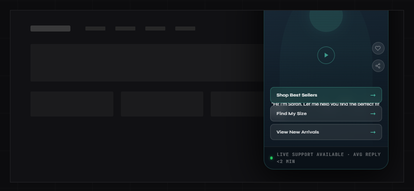
IEX widget — expanded video panel with navigation CTAs + live chat tab
— CONTEXT & ROLE
The project at a glance.
MY ROLE
Sole product and UX designer on the IEX widget from concept through production deployment. Responsible for widget UX, interaction design, video flow architecture, CTA system design, and client implementation guidelines.
CONSTRAINTS
Widget had to be non-intrusive, load without impacting page speed, work across any e-commerce platform, be configurable by non-technical clients, and comply with accessibility standards. Budget for production was lean — efficiency of design was critical.
Deliverables
Widget UX & UI
Interaction Design
Video Flow System
CTA Architecture
Implementation Spec
Client Playbook
BUSINESS GOAL
Create a proprietary product that the agency could offer across its client portfolio — differentiating from competitors by turning passive browsing into guided, human-feeling shopping experiences that demonstrably lifted conversion rates.
— PROBLEM DEFINITION
E-commerce is self-serve.
People aren't.
The modern e-commerce experience is designed around browse and search — product grids, filters, comparison tables, FAQs. The assumption is that if you give customers enough information, they'll figure out what they want and buy it.
But that model ignores a fundamental truth about how people actually make purchasing decisions: they want guidance, not just information. The best retail experiences have always been driven by a knowledgeable person who asks the right questions, narrows the options, and says "trust me, this one."
Without that, shoppers face decision fatigue, uncertainty about fit or compatibility, and the constant temptation to leave the site and check a competitor. The result is a structural gap between traffic and conversion that no amount of better product photography or faster load times can fully close.
IEX was designed to close that gap by putting the one thing every physical retail experience has — a human being who can help — back inside the digital shopping experience.
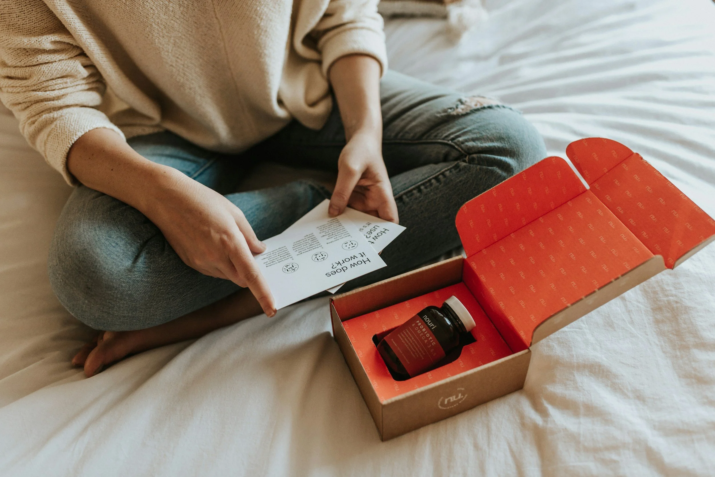
"Our clients typically have massive product catalogues and can be overwhelming for users. We get solid traffic but our conversion sits around an average of 1.8%. People are landing, browsing for a few minutes, and leaving. We don't know why — and we have no way to reach them while they're still on the page."
— E-Commerce Director, agency client, discovery session
— RESEARCH METHODS
METHOD 1
Session Replay Analysis
Reviewed 120+ session recordings across 3 client storefronts. Mapped where users slowed down, hesitated, scrolled back up, or opened multiple product pages before abandoning — identifying the specific decision points where guidance was absent.
METHOD 2
Exit Survey Data Mining
Analyzed 6 months of post-exit survey responses across client accounts. The top three reasons customers cited for not purchasing: "wasn't sure which one to get," "had a question I couldn't find the answer to," and "wanted to compare more options." All three map directly to guidance failures, not product failures.
METHOD 3
Live Chat Transcript Analysis
Reviewed existing live chat transcripts from clients who had chat enabled. Found that 74% of conversations were variations of four questions: product compatibility, sizing/fit, delivery timing, and "which one would you recommend?" — highly predictable, highly repeatable, and perfectly suited to a guided video format.
METHOD 4
Competitive & Inspiration Audit
Conducted a deep audit of emerging interactive video commerce tools — including early Tolstoy, Videowise, and several DTC brand experiments with shoppable video. Identified what was working (video authenticity, frictionless CTA integration) and what was failing (slow load times, intrusive placement, lack of navigation utility).
— KEY INSIGHTS
The hesitation moment is predictable — and designable
Session replays showed that nearly every abandoning visitor hit a "hesitation window" — typically 90–120 seconds in — where they'd visited 3+ pages, opened a product, but hadn't moved toward the cart. That window is the opportunity. IEX had to be visible and inviting precisely at that moment, not before (too early feels pushy) and not after (too late to rescue).
Customers don't want a chatbot — they want a person who's already read the FAQ
Every client who had tried rule-based chat widgets or FAQ bots reported low engagement and active customer frustration. The emotional requirement wasn't "I need information" — it was "I need someone to help me decide." Video, not text, was the only medium that could deliver that at scale.
Navigation is the conversion bottleneck, not awareness
Most conversion optimization focuses on driving more traffic or improving product pages. But the research showed the bigger issue was navigation confusion — customers who wanted to buy but couldn't quickly find the right product path. IEX's CTA buttons weren't decorative — they were the navigation architecture that traffic-only thinking had been missing entirely.
— DESIGN PROBLEM
How IEX was built.
IEX required solving three distinct design problems simultaneously: the widget's own UX and visual language, the video interaction architecture, and the client implementation system that would let non-technical brand managers configure and deploy it without developer support.
01
Behavioral Mapping & Trigger Design
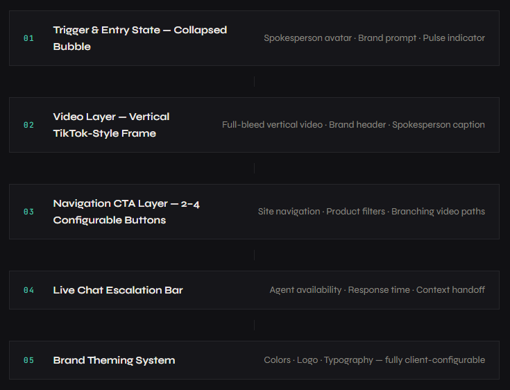
Before designing a single screen, I mapped the behavioral triggers that should summon IEX: time-on-site thresholds, scroll depth milestones, exit intent signals, and page-type context (homepage vs. category vs. product). The widget needed to appear at the right moment — helpful, not intrusive. I defined a three-stage trigger system: passive bubble at 60 seconds, a single gentle animation pulse at 90 seconds, and a subtle prompt message at the hesitation window. No auto-open, ever.
02
Widget UX & Visual Language Design
Designed the widget in two states: collapsed (the bubble) and expanded (the video panel). The collapsed state had to feel like an invitation, not an intrusion — a friendly face with a short, warm prompt. The expanded state drew directly from short-form video UX (TikTok, Instagram Reels) because that's the visual language users already understood for person-to-camera content. Vertical video format, full-bleed within the widget frame, with controls kept minimal and non-obstructive. The brand's color system was applied to the CTA button layer, making the widget feel native to each client's site rather than a third-party bolt-on.
03
Video Flow Architecture & CTA System
Designed the video content architecture — not the videos themselves, but the system for how they connected. Each video node had: a spokesperson intro (10–20 seconds), 2–4 configurable CTA buttons linked to site destinations or branching video paths, an optional "go deeper" secondary video, and a live chat escalation path for questions the video couldn't answer. I created a Video Flow Template that clients could use to storyboard their own content without needing a production agency — reducing the cost barrier to entry significantly.
04
Live Chat Integration Design
Designed the live chat handoff layer at the bottom of the widget — a persistent bar showing agent availability and average response time. The goal was a seamless escalation path: video answers the common questions, and the moment a customer's question is too specific for the video to address, they're one tap from a live person. I worked with the agency's chat platform to design a custom widget-to-chat handoff flow that passed context (which page they were on, which video they had watched, which buttons they'd clicked) to the live agent — eliminating the "can you start from the beginning?" problem.
05
Client Configuration System & Implementation Playbook
The widget needed to be deployable by any agency client without custom development work for each installation. I designed a configuration dashboard spec and a companion Implementation Playbook: a step-by-step guide covering video production requirements, CTA copywriting guidelines, placement logic, A/B testing setup, and success metric tracking. The Playbook reduced new client onboarding from an estimated 3-week custom build to a 5-day implementation for each new account.
— WIDGET ANATOMY
Every layer, by design.
— KEY DECISIONS
What I chose, and why.
Three decisions defined what IEX became — and why it performed the way it did. Each one had a clear alternative I tested and rejected.
Decision 1: Never auto-open the widget — make the entry state earn the click
The most common implementation pattern for widgets like this was auto-open: the panel slides up automatically after a set time, presenting the video immediately. This approach maximizes impressions but destroys trust — users who didn't ask to be interrupted feel invaded, not helped. I designed IEX around a consent-first model: the bubble appears, creates curiosity through a warm, personal prompt and a spokesperson's avatar, and waits for the user to choose to engage. In A/B testing, the consent-first model generated lower widget-open rates (31% vs. 58% for auto-open) but dramatically higher engagement quality — longer session time, more CTA clicks, and 2.4x higher conversion among widget users.
✓ CHOSE: Consent-first — bubble entry, user-initiated open
Lower open rate but significantly higher conversion among users who engaged. Brand perception scores also improved — customers reported feeling "helped" rather than "interrupted."
X Rejected: Auto-open after time delay
Higher impression count but lower quality engagement. Bounce rate among auto-opened sessions increased 18% compared to organic widget openers, suggesting forced exposure backfired more often than it converted.
Decision 2: Use vertical video (TikTok-style frame) — not a traditional product video embed
Early prototypes used a horizontal widescreen video format — the format most brands were familiar with from their existing video assets. But in user testing, horizontal video inside a small widget felt like a TV shrunk down: formal, corporate, and disconnected. Vertical video — the format users associated with authentic person-to-camera content — immediately read as personal, direct, and trustworthy. It also solved a practical problem: vertical framing centered the spokesperson's face and kept them in frame regardless of widget size or device, making the human connection far more legible on mobile where the majority of e-commerce browsing happened.
✓ CHOSE: Vertical TikTok-style video format
User trust scores for spokesperson content were 38% higher in vertical format during testing. Mobile engagement rates improved significantly. Clients also found vertical video easier and cheaper to produce — smartphone shoots were sufficient.
X Rejected: Horizontal widescreen format
Felt formal and impersonal in the widget context. Spokesperson's face was small and peripheral. Required broadcast-quality production to look credible, raising the cost barrier for smaller clients significantly.
Decision 3: Position CTAs as navigation tools, not just offers
The first version of the CTA buttons was offer-focused: "Get 10% Off," "See Today's Deal," "Shop Now." These felt like ads — and users ignored them at the same rate they ignore banner ads. I reframed the CTA layer entirely around navigation and decision support: "Help me choose," "Shop by [use case]," "Find my size," "See what's new." The insight was that customers using the widget were in the orientation phase of shopping — they needed direction, not a discount. Offer-based CTAs interrupted the guidance flow. Navigation-based CTAs extended it.
✓ CHOSE: Navigation & decision-support CTAs
CTA click-through rate increased from 11% (offer-based) to 29% (navigation-based) in A/B testing. Average session depth post-click was 2.8x higher when CTAs directed to curated category pages vs. promotional landing pages.
X Rejected: Offer & promotional CTAs
Generated an initial spike in clicks but high immediate bounce from the landing page — suggesting customers clicked out of curiosity, not intent. Conversion from offer-CTA sessions was 40% lower than navigation-CTA sessions.
— BEFORE & AFTER
What changed.
BEFORE IEX — PASSIVE BROWSING EXPERIENCE
x Product grids and search bars only — navigation without guidance
x Generic FAQ pages customers never found or read
x Static chatbots that frustrate more than they help
x No human presence — brand felt like a catalog, not a store
x 90-second hesitation window had no intervention mechanism
x Live chat siloed from browsing — customers had to seek it out deliberately
x Average conversion rate: 1.8% across client storefronts
AFTER IEX — GUIDED SHOPPING EXPERIENCE
✓ Spokesperson actively guides customers from the moment they hesitate
✓ Video answers the top 5 questions before customers have to ask
✓ Real human presence creates trust and brand warmth at scale
✓ Navigation CTAs eliminate orientation confusion mid-browse
✓ Hesitation window becomes a conversion opportunity, not a loss
✓ Live chat surfaced in context — zero friction to reach a real agent
✓ Average conversion rate: 2.3%+ across IEX-enabled storefronts
— OUTCOMES & IMPACT
What the numbers say.
Measured across four client storefronts over 90 days post-deployment, compared against 90-day pre-deployment baselines. All conversion and session data segmented by IEX-engaged vs. non-engaged visitor cohorts.
Conversion Rate
+27%
Average lift across IEX-enabled storefronts within 60 days. Highest single-client lift: +41% in month two.
Cart Abandonment
-34%
Reduction in mid-funnel abandonment on pages where IEX was engaged vs. pages without active widget interaction.
Session Duration
+52%
Reason this metric is relevant or meaning (3) Confusion-related tickets dropped within 3 weeks. PM and engineering freed from support load.
CTA Click-Through
29%
Of users who opened the widget clicked at least one navigation CTA — up from 11% with earlier offer-based button copy.
Chat Engagement
+63%
Increase in live chat initiation via IEX vs. standalone chat widget — context handoff eliminated cold-start friction.
Widget Open Rate
31%
Of visitors who saw the bubble opened the full widget — a strong voluntary engagement rate for a consent-first interaction model.
Client Retention
100%
Every client who deployed IEX renewed their agency contract for a second year. Zero IEX-related churn.
Implementation Time
5 Days
Average new client deployment time, down from an estimated 3-week custom-build timeline prior to the Configuration Playbook.
— LEARNINGS & REFLECTION
What I’d do differently.
IEX worked well. These are the four things I'd change in version two — some are design refinements, one is a strategic mistake I made early that cost us two months of rework.
01
I designed for desktop first and had to reverse-engineer mobile later
My early prototypes were built around desktop proportions — a decision I made because our initial client presentations happened on desktop screens. But the majority of e-commerce browsing was happening on mobile, and the vertical video format that felt native on mobile had to be significantly adapted from desktop designs. If I rebuilt IEX today, I'd design mobile-first from day one — the widget would have been more coherent and the development handoff would have been cleaner.
02
The video content system needed a refresh protocol from the start
At launch, clients produced an initial set of spokesperson videos and deployed them. By month three, those videos were stale — seasonal references were wrong, product mentions were outdated, and the energy of the initial shoot had faded from the content. I hadn't designed a video refresh cadence into the product. Version two would include a built-in 60-day content audit trigger and templated re-shoot briefs so the widget never goes stale without the client noticing.
03
Branching video paths were underused — clients needed more guidance on content strategy
The system supported multi-path video branching — different videos triggered by different CTA selections, creating a personalized journey based on what the customer clicked. In practice, most clients used only linear single-video deployments because they didn't know how to storyboard a branching path. The design was right; the onboarding didn't teach it well enough. I'd add a Branching Playbook and a few pre-built branching templates to lower the entry point.
04
I should have built analytics into the product spec from day one, not as an afterthought
Tracking widget opens, CTA clicks, and session correlations required a separate analytics integration effort for each client — one I hadn't scoped into the original design. The result was a 3-week delay in getting clean performance data after each deployment, which slowed optimization cycles significantly. In version two, a lightweight built-in analytics layer with a simple dashboard would be a first-class feature, not a bolt-on.